
What Exactly Is WordPress Responsive Web Design, and Why Does It Matter?

Introduction
In today’s digital landscape, having a website is not enough; it must be responsive to meet the expectations of modern users. With most internet traffic coming from mobile devices, ensuring your WordPress website is responsive has become essential. But what exactly is WordPress responsive web design, and why is it so crucial?
This blog will explore the concept of WordPress responsive web design, its importance, and how you can implement it for a seamless user experience.
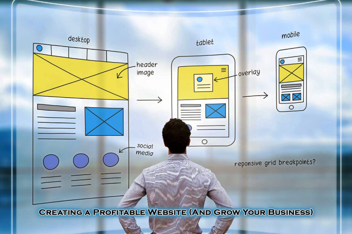
What is WordPress responsive web design?
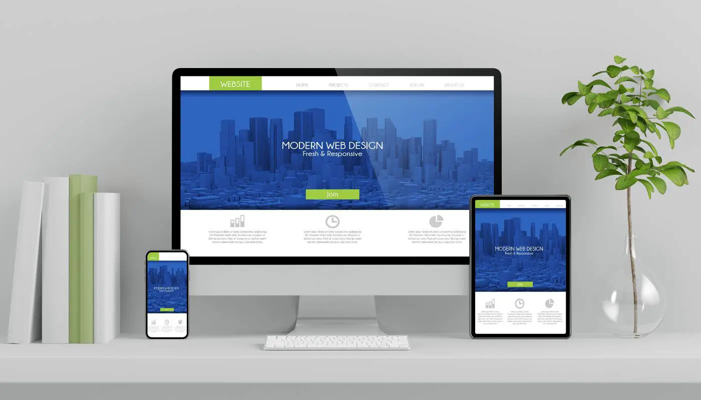
WordPress responsive web design refers to a design approach where a website automatically adjusts its layout, images, and elements based on the screen size and device type. Whether a user is visiting from a desktop, tablet, or smartphone, a responsive WordPress site ensures that they have an optimal viewing experience without the need for zooming, scrolling, or resizing manually.
Why does responsive design matter?
Mobile Traffic is Increasing Rapidly
More than 60% of web traffic now comes from mobile devices. If your WordPress site isn’t optimised for different screen sizes, you risk losing a huge portion of potential visitors.
Improved User Experience (UX)
A responsive website provides a smooth navigation experience, ensuring that menus, buttons, and content are properly displayed, enhancing usability and engagement.
Better SEO Rankings
Google prioritises mobile-friendly websites in search results. A responsive WordPress website improves your chances of ranking higher in search engine results pages (SERPs), bringing in more organic traffic.
Faster Page Load Speed
Responsive design ensures that images, content, and elements load efficiently on all devices, improving site speed, which is a key ranking factor for Google.
Cost-Effectiveness
Instead of managing separate desktop and mobile versions of your site, a responsive design allows you to maintain one website that works across all devices.
Increased Conversions and Sales
A website that is difficult to navigate on mobile devices can lead to high bounce rates and lost conversions. A well-optimised responsive website keeps users engaged and encourages them to take action, such as making a purchase or filling out a contact form.
How to Make Your WordPress Website Responsive?
Choose a Responsive WordPress Theme
Select a mobile-friendly theme from the WordPress theme directory or premium theme providers like Astra, Divi, or GeneratePress.
Use a Mobile-Optimized Page Builder
Tools like Elementor, WPBakery, and Beaver Builder allow you to design layouts that adapt to different screen sizes effortlessly.
Enable Mobile-Friendly Navigation
Use hamburger menus for smaller screens and ensure that buttons and links are large enough to be clicked on touch devices.
Optimize Images and Media
Compress images using tools like Smush or ShortPixel to ensure faster loading times without compromising quality.
Utilize Responsive Plugins
Install WordPress plugins such as WP Mobile Menu and AMP (Accelerated Mobile Pages) to enhance mobile responsiveness.
Test Your Website Across Devices
Use tools like Google’s Mobile-Friendly Test or BrowserStack to check how your WordPress site appears on different screen sizes.
Conclusion
Having a responsive WordPress website is no longer optional—it’s a necessity. A mobile-friendly website enhances user experience, improves SEO rankings, and boosts engagement and conversions. By implementing responsive design strategies, you ensure that your website remains accessible and functional across all devices.
Make sure to regularly test and update your WordPress site to keep up with changing technologies and user expectations. With a well-optimized responsive website, your business can reach a wider audience and achieve better results online.
You can use Google’s Mobile-Friendly Test or open your site on different devices and browsers to check responsiveness.
Not necessarily. Many WordPress themes and page builders offer built-in responsive design features that allow you to adjust layouts without coding.
A responsive website adjusts elements for better display but doesn’t change the core design. Instead, it ensures a smooth experience across devices.
Yes, by using CSS media queries, responsive plugins, and ensuring mobile-friendly navigation, you can improve the responsiveness of an existing theme.
Your site may not display correctly on mobile devices, leading to poor user experience, lower SEO rankings, and higher bounce rates.
Ensuring that your WordPress website is responsive will keep you ahead of the competition and provide a seamless experience for all visitors.